 Pearls
Along The Path by Ronald Paul Hill. This book has a 5
1/2 x 8 1/2 trim size. Prof. Hill teaches at a university in the
Portland, Oregon vicinity. Over the years he's learned some valuable
lessons about life. He shares his hard-won knowledge in this book.
Obviously the curving 'golden' stroke is a path... with some pearls
strewn along the way. The colors were chosen for high impact when
placed in a typical bookstore. The back cover has a full-color
photo of the author. Cover is printed using 4-color process inks.
Pearls
Along The Path by Ronald Paul Hill. This book has a 5
1/2 x 8 1/2 trim size. Prof. Hill teaches at a university in the
Portland, Oregon vicinity. Over the years he's learned some valuable
lessons about life. He shares his hard-won knowledge in this book.
Obviously the curving 'golden' stroke is a path... with some pearls
strewn along the way. The colors were chosen for high impact when
placed in a typical bookstore. The back cover has a full-color
photo of the author. Cover is printed using 4-color process inks.
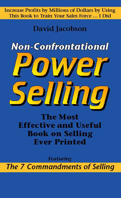 Non-Confrontational
Power Selling by David Jacobson is one of the scariest
books I've ever read. This book covers advanced selling techniques
for automobile salespeople. (The sales techniques described would
generally be effective for a wide variety of sales professionals,
but the writer comes from the automobile industry and has used
specific automobile dealer examples and circumstances.) The most
frightening chapter is entitled "How to stay high, and make
it look hard." Of course the subject is the price and "keeping
it high" is considered most desirable (by the salesperson
and the dealer). I won't give away the secret of this chapter,
but if you are negotiating purchase of a vehicle and the sales
person leans forward in a "conspirital manner" and says,
"don't tell your friends about this price." --hold on
to your wallet! You're about to get a high price. Don't tell your
friends, because they will think you're a sucker! The cover was
printed using 4-color process inks. Trim size is 5 1/2 by 8 1/2
inches.
Non-Confrontational
Power Selling by David Jacobson is one of the scariest
books I've ever read. This book covers advanced selling techniques
for automobile salespeople. (The sales techniques described would
generally be effective for a wide variety of sales professionals,
but the writer comes from the automobile industry and has used
specific automobile dealer examples and circumstances.) The most
frightening chapter is entitled "How to stay high, and make
it look hard." Of course the subject is the price and "keeping
it high" is considered most desirable (by the salesperson
and the dealer). I won't give away the secret of this chapter,
but if you are negotiating purchase of a vehicle and the sales
person leans forward in a "conspirital manner" and says,
"don't tell your friends about this price." --hold on
to your wallet! You're about to get a high price. Don't tell your
friends, because they will think you're a sucker! The cover was
printed using 4-color process inks. Trim size is 5 1/2 by 8 1/2
inches.
Heretic
is a novel by Bill Howden. It is an account of a new realization
by a Bishop of the Church concerning the relationship between
humanity and Christ. This new realization, however, runs counter
to Church teachings. The Bishop must try to persuade the Church
leadership of the sincerity and correctness of his view. Reaching
out to his Seminary professor, who planted the 'seeds' of his
new awareness many years before, the Bishop is shocked to find
that his old mentor vehemently objects to the Bishop's view and
will lead the opposition toward the first Heresy trial by the
church in a century. Tension is enlivened by the interplay between
the Bishop's 'old girlfriend,'' who is now a skeptical journalist,
and his confused wife, who simply doesn't understand what this
crisis of conscience is about. A good read. Published by Dragon
Wagon Publishing. The cover design was derived to highlight the
drama of the story. While the color combination appears simple,
it actually uses 4-color process inks. This also allowed a full-color
photo of the author to appear on the back cover.
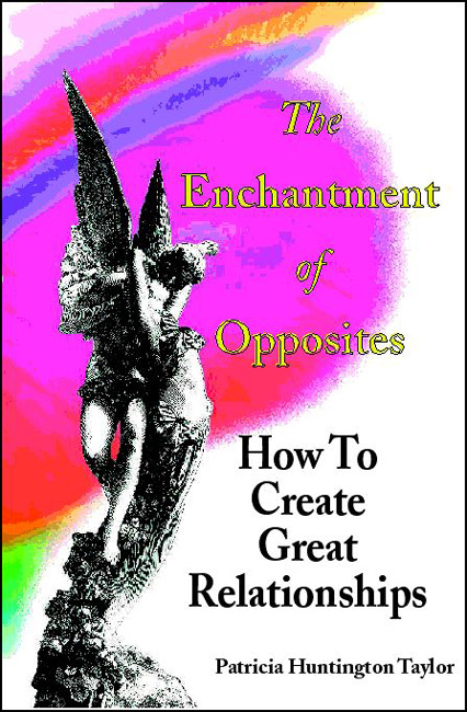 The
Enchantment of Opposites. This project was
brought to us after it was well underway. Both the cover and the
interior design "had problems" that we were asked to
solve. We were able to re-specify various type sizes and faces
used. Distracting boxes of "set off" text were eliminated,
instead using bold type centered in the page to establish the
necessary emphasis for those elements. Finally, several common
typographical errors were corrected. In this case the page layout
work was done by the author (and family) and the Aeonix role was
limited to consulting and assistance where necessary. Those working
on the page layout were given instruction in the various typographical
issues and were shown how to most effectively use their software.
The
Enchantment of Opposites. This project was
brought to us after it was well underway. Both the cover and the
interior design "had problems" that we were asked to
solve. We were able to re-specify various type sizes and faces
used. Distracting boxes of "set off" text were eliminated,
instead using bold type centered in the page to establish the
necessary emphasis for those elements. Finally, several common
typographical errors were corrected. In this case the page layout
work was done by the author (and family) and the Aeonix role was
limited to consulting and assistance where necessary. Those working
on the page layout were given instruction in the various typographical
issues and were shown how to most effectively use their software.
The cover originally was created by a graphic artist who had no experience with books. The underlying art (heart and statues) was continued on the final version. However, Aeonix re-set all the type on the front and back of the cover to maximize the shelf presence on book store shelves. The cover was printed using 4-color process inks plus "gold" metallic ink (as a spot-color) for the main title.
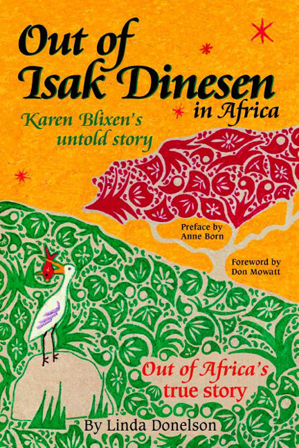 Out
of Isak Dinesen in Africa. This is a second
edition of the original book. A new cover was created using an
original painting by the author's daughter. A transparency of
the painting was scanned using a high resolution drum scanner.
The image file was then extensively altered to accommodate the
cover text, both front and back. Many image elements were changed
or moved to make the painting work as a book cover. For example,
a peacock once stood where the "Out of Africa's true story"
text now resides. The peacock was moved to the back of the book
to replace an antelope that was deleted. The tree on the front
and a similar tree on the back were moved and adjusted to fit
the design and flow of the text elements. The contour of the hill
was also altered to better support the design. On the spine, the
green "things" were removed or altered to create a channel
for the spine text. At the top of the spine, a black and white
photo of Isak Dinesen was inserted. The resulting image file was
approximately 42 megabytes. The files were delivered on CD-ROM
for the convenience of the customer and the printer. Printed in
4-color process inks.
Out
of Isak Dinesen in Africa. This is a second
edition of the original book. A new cover was created using an
original painting by the author's daughter. A transparency of
the painting was scanned using a high resolution drum scanner.
The image file was then extensively altered to accommodate the
cover text, both front and back. Many image elements were changed
or moved to make the painting work as a book cover. For example,
a peacock once stood where the "Out of Africa's true story"
text now resides. The peacock was moved to the back of the book
to replace an antelope that was deleted. The tree on the front
and a similar tree on the back were moved and adjusted to fit
the design and flow of the text elements. The contour of the hill
was also altered to better support the design. On the spine, the
green "things" were removed or altered to create a channel
for the spine text. At the top of the spine, a black and white
photo of Isak Dinesen was inserted. The resulting image file was
approximately 42 megabytes. The files were delivered on CD-ROM
for the convenience of the customer and the printer. Printed in
4-color process inks.
 In the Company of Spirits, The Memoirs
of a Medium by Karen Lundegaard is a story about the experiences
of growing up with special sensory gifts. The cover features a
black & white photo of the author and is designed to be printed
as a "two color" job; in part because of the available
photos and to keep reproduction cost down. Additional black &
white photos are used on the back of the book. The back cover
photo originated as two photos showing individuals and scenes
described in the book. These two original photos were 'stitched'
together to create a single 'panorama' type shot. This cover was
designed to be printed as a two-color job. Since the cover photos
were all black and white, it was appropriate to save on printing
cost.
In the Company of Spirits, The Memoirs
of a Medium by Karen Lundegaard is a story about the experiences
of growing up with special sensory gifts. The cover features a
black & white photo of the author and is designed to be printed
as a "two color" job; in part because of the available
photos and to keep reproduction cost down. Additional black &
white photos are used on the back of the book. The back cover
photo originated as two photos showing individuals and scenes
described in the book. These two original photos were 'stitched'
together to create a single 'panorama' type shot. This cover was
designed to be printed as a two-color job. Since the cover photos
were all black and white, it was appropriate to save on printing
cost.
 Thai
Traditional Medical Massage, by Supron Mukomla,
is a general discussion of this ancient knowledge and a text book
for those learning to perform the traditional treatments. The
background cover painting was done by a friend of the author.
The original was photographed, and the photo was scanned to create
a digital image. The original composition was a rather different
shape than could be used for the book, so the image was manipulated
to make the composition 'fit' the cover. The smaller 'Lotus Blossom'
was moved and other elements were adjusted to work with the cover
size and shape and to allow good placement of the cover text.
The book is in a 7 x 10 format to allow good images of the original
drawings of temple carvings that are the basis of this traditional
medical massage. Generous margins were provided to allow students
room to take notes. This cover was printed using 4-color process
inks.
Thai
Traditional Medical Massage, by Supron Mukomla,
is a general discussion of this ancient knowledge and a text book
for those learning to perform the traditional treatments. The
background cover painting was done by a friend of the author.
The original was photographed, and the photo was scanned to create
a digital image. The original composition was a rather different
shape than could be used for the book, so the image was manipulated
to make the composition 'fit' the cover. The smaller 'Lotus Blossom'
was moved and other elements were adjusted to work with the cover
size and shape and to allow good placement of the cover text.
The book is in a 7 x 10 format to allow good images of the original
drawings of temple carvings that are the basis of this traditional
medical massage. Generous margins were provided to allow students
room to take notes. This cover was printed using 4-color process
inks.
 Mounted
in the City by the Bay is a semi-fictional account of
real life action by members of the San Francisco Mounted Police
Patrol in San Francisco's Golden Gate Park. The book was written
by Richard Blanchard, a long time observer of Mounted Police activities
(he boarded his horse in the same stable used by the SFPD) and
friend and acquaintance of many SFPD Mounted Patrol officers.
The cover painting was done by Luis Busta. The cover painting
was photographed and the original was digitized by a photographic
service to a Kodak Photo CD. The digital image was then manipulated
to fit the size and shape of the book, with and extension of the
original painting made to wrap around to the back side of the
cover. This cover was printed using 4-color process inks.
Mounted
in the City by the Bay is a semi-fictional account of
real life action by members of the San Francisco Mounted Police
Patrol in San Francisco's Golden Gate Park. The book was written
by Richard Blanchard, a long time observer of Mounted Police activities
(he boarded his horse in the same stable used by the SFPD) and
friend and acquaintance of many SFPD Mounted Patrol officers.
The cover painting was done by Luis Busta. The cover painting
was photographed and the original was digitized by a photographic
service to a Kodak Photo CD. The digital image was then manipulated
to fit the size and shape of the book, with and extension of the
original painting made to wrap around to the back side of the
cover. This cover was printed using 4-color process inks.
 The
Health and Wealth Handbook. This book has a 4 1/4 x 9
inch trim size. It is a handbook for multi-level marketing salespeople
working with health-related products. It offers advice on how
best to sell the product-line and how to approach expanding the
network of distributors and salespeople. It is printed in 4-color
process inks. The design was created to be very eye catching...
so if it were placed in view, a (potential) client or sub-distributor
might be interested and ask about the book... allowing the start
of a 'pitch' for joining the marketing organization.
The
Health and Wealth Handbook. This book has a 4 1/4 x 9
inch trim size. It is a handbook for multi-level marketing salespeople
working with health-related products. It offers advice on how
best to sell the product-line and how to approach expanding the
network of distributors and salespeople. It is printed in 4-color
process inks. The design was created to be very eye catching...
so if it were placed in view, a (potential) client or sub-distributor
might be interested and ask about the book... allowing the start
of a 'pitch' for joining the marketing organization.
How to Produce Fabulous Fundraising Events by
Betty Stallings & Donna McMillion. This book  offers help to those
who manage fundraising events for non-profit organizations. It
features a step-by-step guide for producing "The Dynamite
Dinner," which has proved to be a most successful fundraising
event.
offers help to those
who manage fundraising events for non-profit organizations. It
features a step-by-step guide for producing "The Dynamite
Dinner," which has proved to be a most successful fundraising
event.
This book has an 8 1/2 x 11 trim size. The cover design was designed to also look particularly good at the size of this thumbnail when printed (at somewhat higher resolution than the Web) in a catalog, the main source of buyers for this book. Printed using 4-color process inks.
Teaching Adults is a 4 1/4 x 9 inch booklet written by Paula Bernstein. It has excellent tips for improving presentations, particularly when being given in an adult learning situation. (I've actually used some of the tips for presentations I've made before a large group). Tips booklets can be quite profitable. While most regular books get sold one at a time, tips booklets are often sold to organizations or companies... who buy booklets for each of their members or employees. (You may sell 25-500 in a single order.) This was actually a re-issue of the booklet. Previously it looked rather less professional, both inside and on the cover. Now it is typeset with a coherent design that's carried from the cover right into the interior design. (The main typeface is Adobe Garamond, which is both elegant and an efficient typeface to use. The booklet has 20 pages. The covers are printed on 80# gloss text paper with white interior pages, bound with a saddle stitch. Covers were printed using 4-color process inks in quantity at Tu-Vets in Los Angeles, while the interiors are run at a local copy shop 2 or 3 hundred at a time. The covers were received untrimmed and unfolded, so the copy shop can easily assemble the booklets and trim them to final size.
There are many issues in creating and publishing a professional-looking book to be sold in book stores, specialty shops or through direct mail and the Internet. The business consultants, publications designers and typographers at Aeonix Publishing Group can help you with producing your book. We can give you advice, as a consultant or trainer, or we can produce a complete camera-ready book for you. We also can design covers and marketing materials for your book. In addition, we can help you prepare RFQs for printers and evaluate the bids you receive and give you guidance with tax issues, marketing, and distributing your book.
To contact Aeonix Publishing group, send an e-mail to Info@Aeonix.com
| Home Page | Common Typos | Page Layout | Vanity Press |
| Print On Demand | Digital Presses | Book Printers | Publishing with PDF |
| POD Production | Sample Covers | About Aeonix | Links |